
01_BACKGROUND
In 2020 April, the whole world started to work from home because of the pandemic. When it comes to Intero, a traditional, none tech real estate company, employees were suffered from disconnecting with each other. Also with the covid 19 hit the economy, agents were discouraged and way less motivated to do their sales work than before.
So the CEO was looking for some light-weight tool for his agents to enable them stay connected and motivated.

02_CHALLENGE
However, back to that time, DareMe was a consumer-facing app. All the challenges are pre-created in the app, while Intero wanted specific sales work focused challenges. Also they wanted to introduce the collaboration with DareMe on their monthly all hands meeting next Monday.

03_GOALS
Since the app was serving public users, we wanted to enable agents to do private challenges while not affecting public users. Moreover, we wanted to get as many as agents to voluntarily join the program on the all hands meeting by delivering an appealing-to-use product.
With constrains on my mind-
1. Not affecting public users(primary users)
2. For not tech-savvy users
3. One week
Instead of exploring multiple ideas to find the best one, I decided to come up with ONE solution ASAP.
04_DESIGN
Enterprise users will be able to download and sign up, then with submitting a special code, we will be able to tell if they are enterprise users, so we can load the special challenges for them.
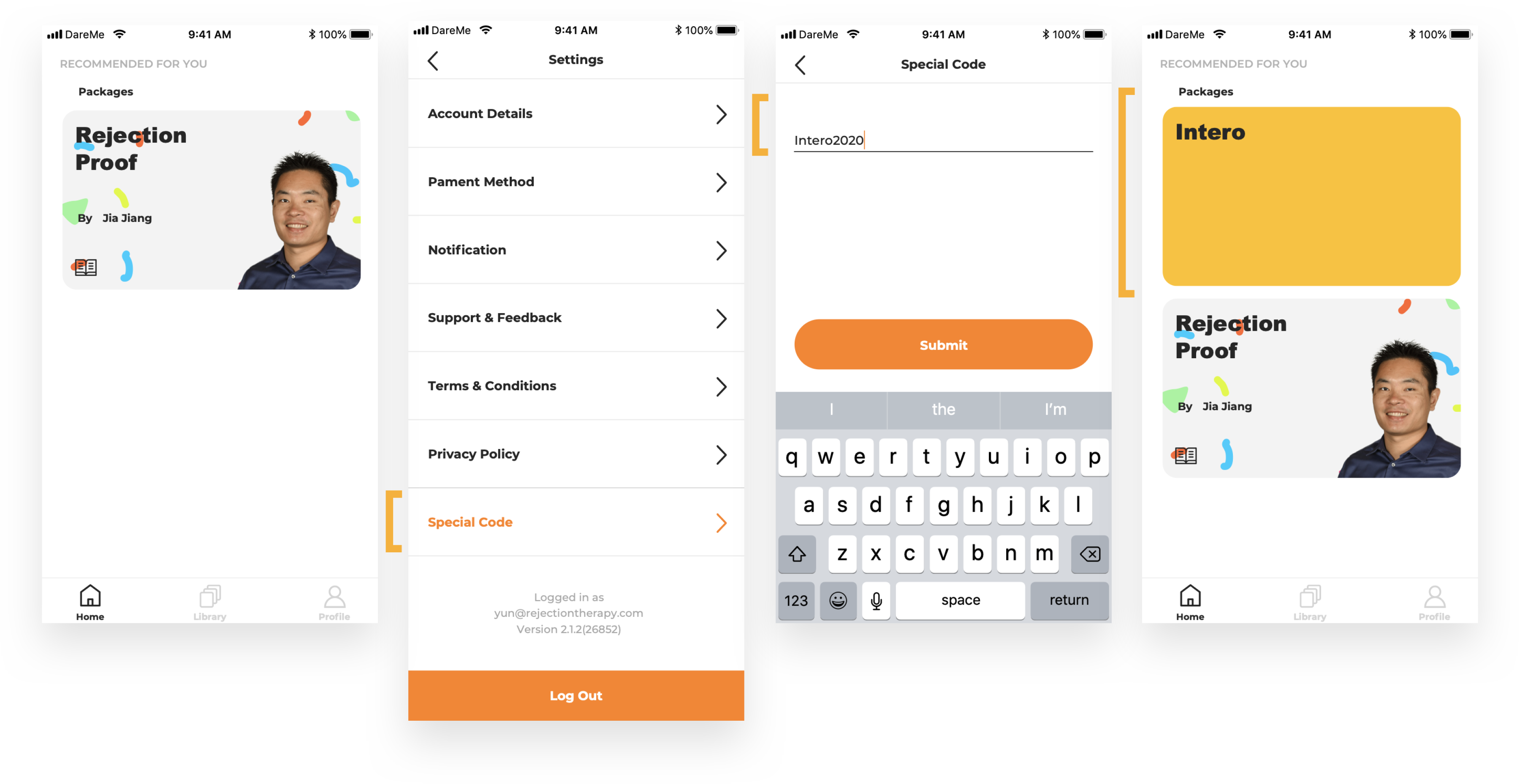
However, the solution got rejected since the managers didn't want the agents to be distracted by public challenges.
Solution #2 - Private workspace - which requires a special tunnel for enterprise users from the very beginning
Enterprise users will sign up from a separated tunnel, so that we can tell at the very beginning and load their workspace for them.
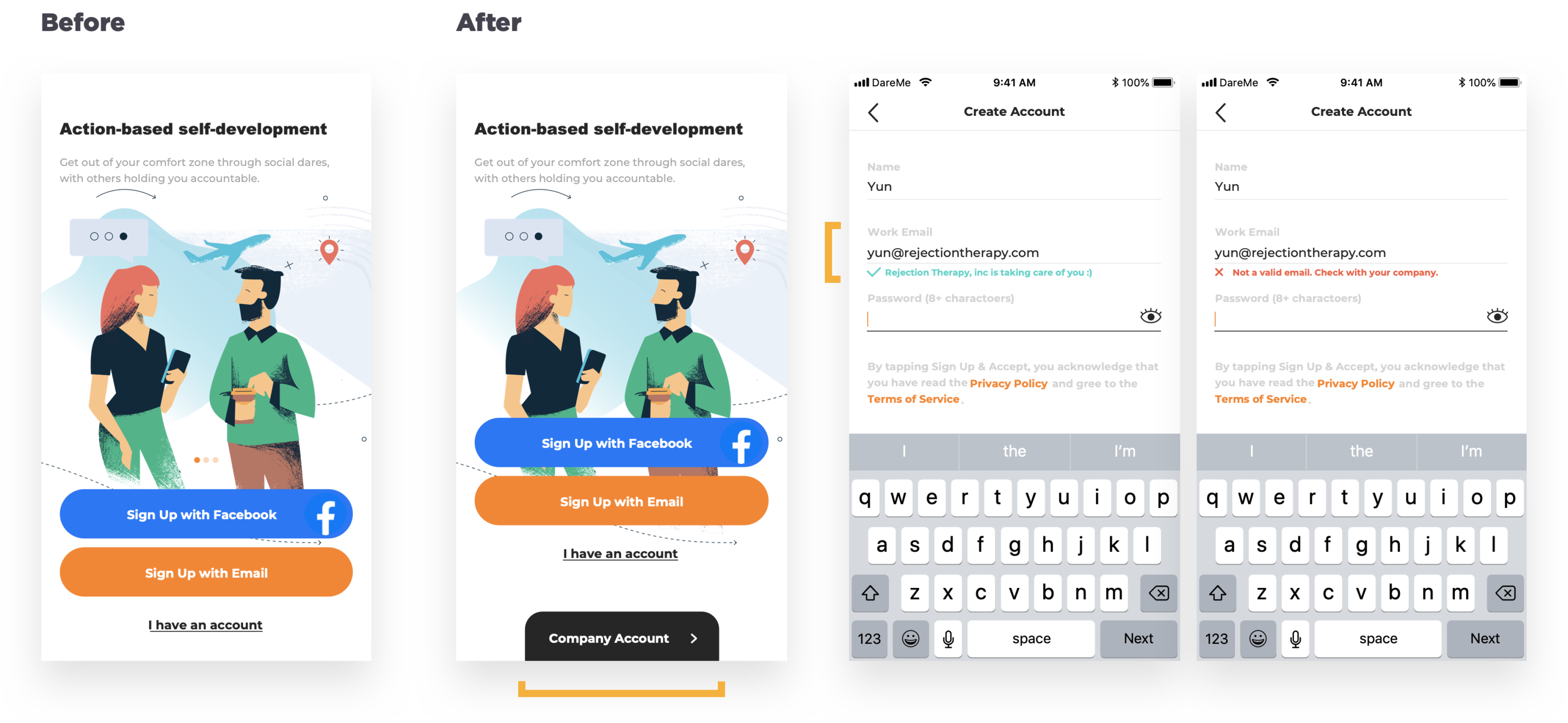
This time, the managers liked the idea and I started to complete the whole experience.
05_DEVELOPEMENT & TESTING
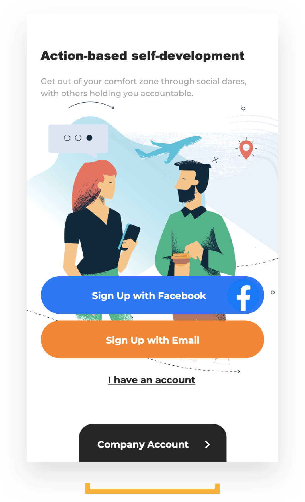
I collaborated with the engineers to build it up within 2 days and recruited one team of the agents to test it out with sending out onboarding guide. However, 9% of them failed to sign up as enterprise users because of the CTA lacks of discoverability. After discussing the testing result with the PM, we decided to improve sign up successfully rate instead of fixing their accounts manually, which was not scalable and demotivated users, potentially jeopardize our business opportunity in the future.

06_ITERATING
To increase discoverability, I tried three options-
1. Increase the visibility of the enterprise CTA by bigger size
2. Increase the visibility of the enterprise CTA by animation
3. Decrease the numbers of CTAs
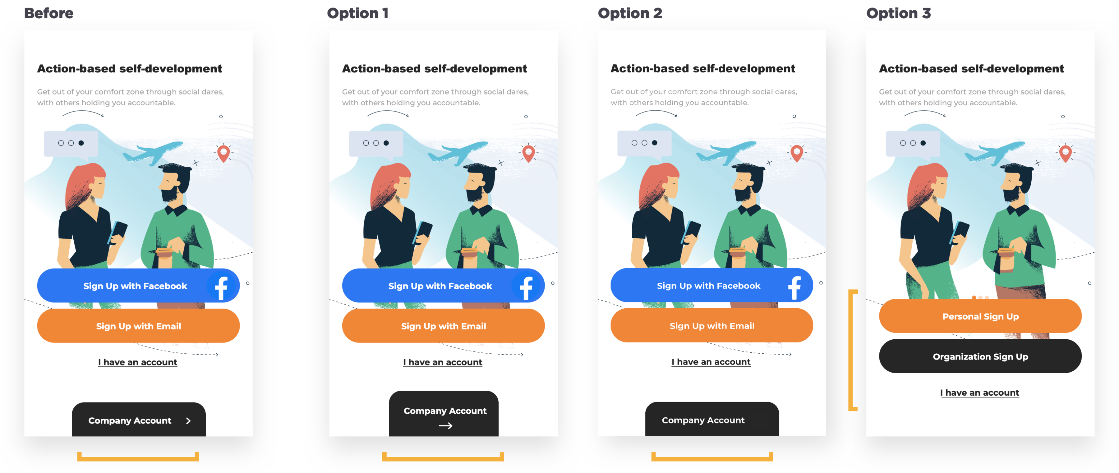
However, the result of user testing proved-
As long as public users' CTA displaying, enterprise users will always have the chance to miss their CTA — "Company Account" button.
So I started to ask myself - Should public users be prioritized?
07_REDEFINE THE GOAL & METRICS
I convinced the team with my testing result & business impact/vision to serve our enterprise users equally important as public users. So that both of them will be able to sign up successfully.
The metrics that I kept up with-
1. Sign up successfully rate
2. Drop out rate
3. Time on each step
08_DESIGN
Solution #3
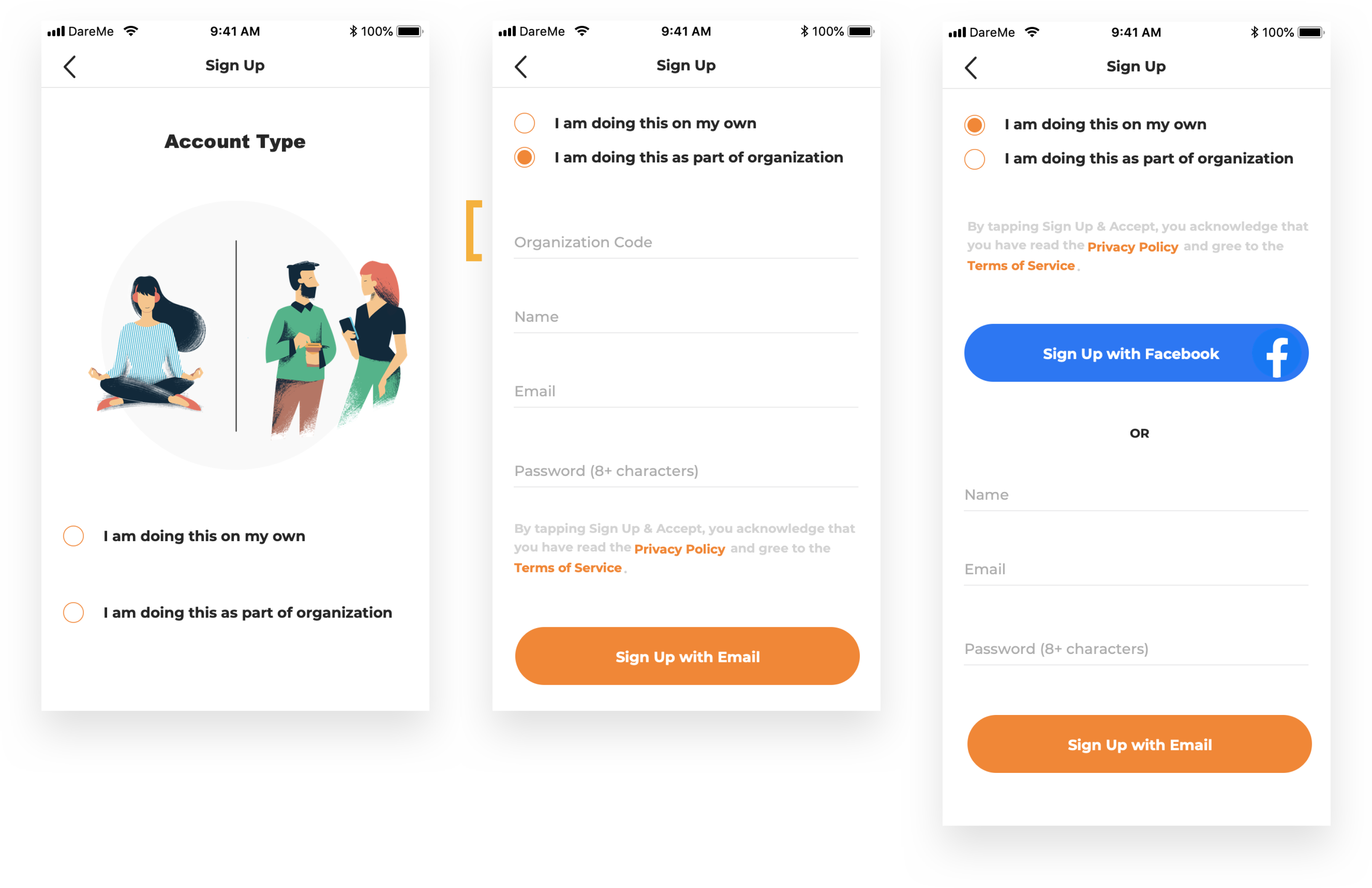
1. Identification page
2. Organization code first
After clicking signing up, users will see the identification page and let the app know who they are. With displaying the organization code field first, public users will get a hint to rethink about their identification choice. After several internal testing, we were confidently to launch this version.
09_RESULT
We were able to launch the new onboarding experience in a week and recruited 150+ agents to sign up for this program. Most importantly, all of them sign up as enterprise users.

10_IMPROVEMENTS
After several rounds of collaboration with Intero, we sensed the needs of adopting a more flexible and scalable onboarding system which requires no manual work from us — no more kick-off meetings or organization code.
Here is the new onboarding experience for enterprise users - managers can create workspace, invite and manage members, employees will be able to sign up with accepting the invitation via email.

Here is the new challenge creating experience — everyone can create challenges and invite workspace members to join — we never have to create and publish challenges for our enterprise users any more :)
