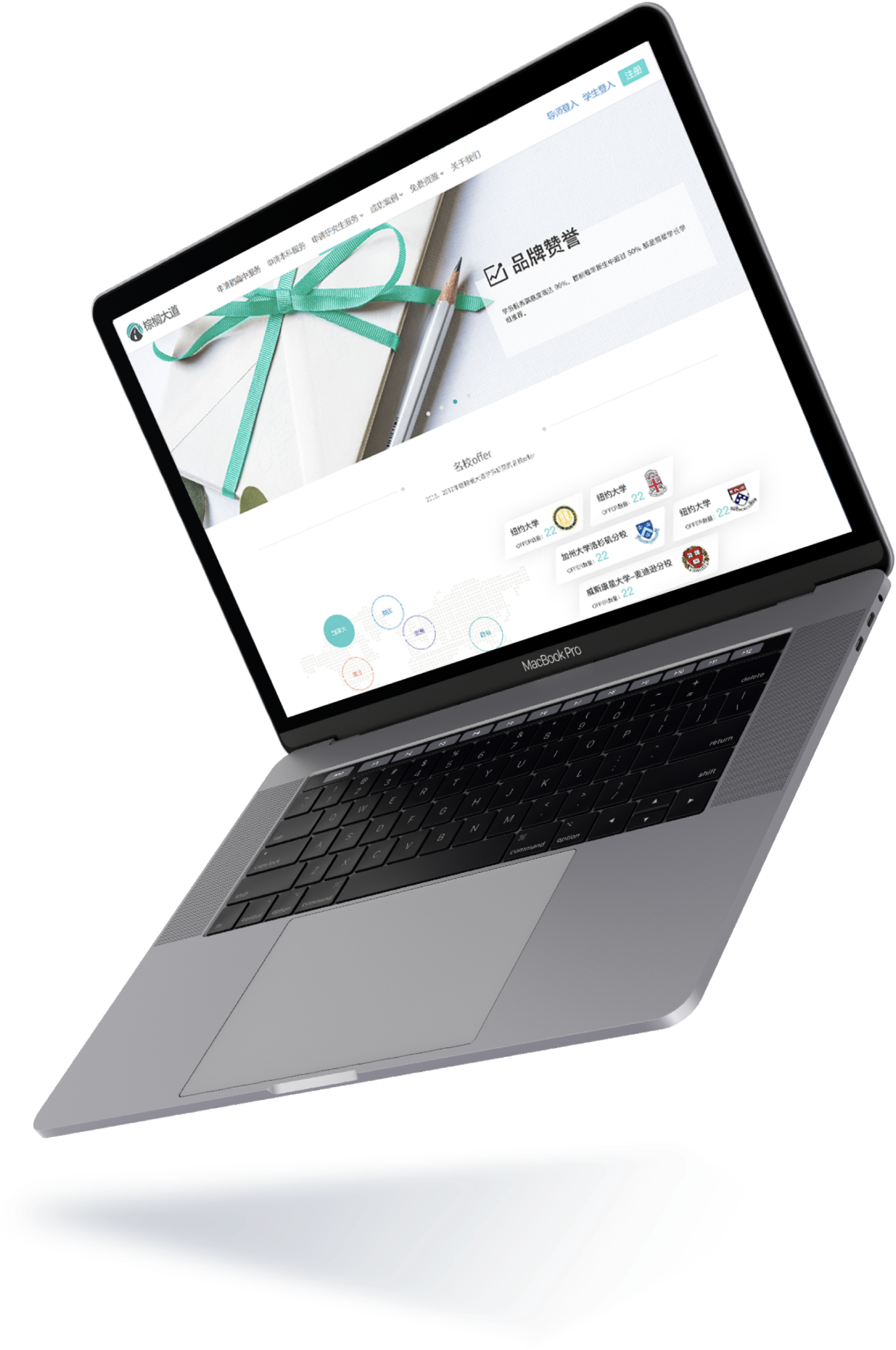
01_BACKGROUND
Since our marketing site that failed to convert, students who came to consult from the internet wasn't increasing as expected while internet search on Palmdrive boosted dramatically in 2018.
I collaborated with the marketing team to redesign the website and decided to start with the Graduate Application pages first.
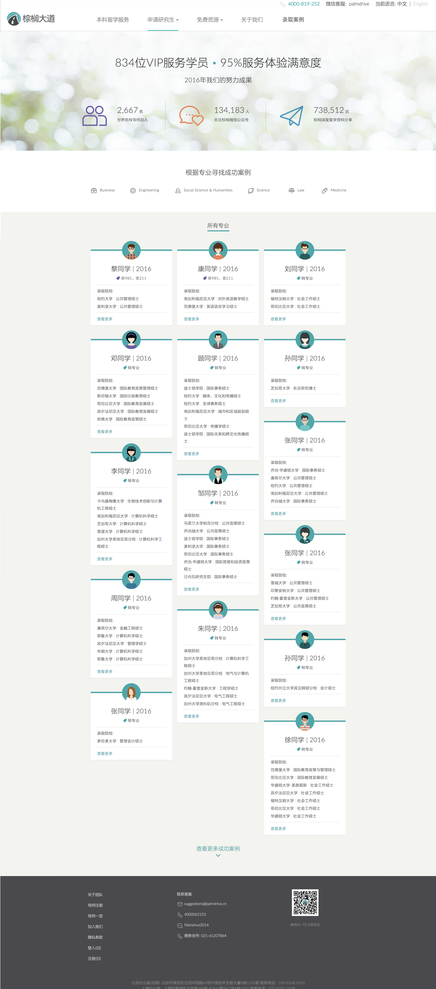
The original graduate info page
02_RESEARCH
To figure out the user journey, I used Google Analytics as hint on how users interacted with our website.
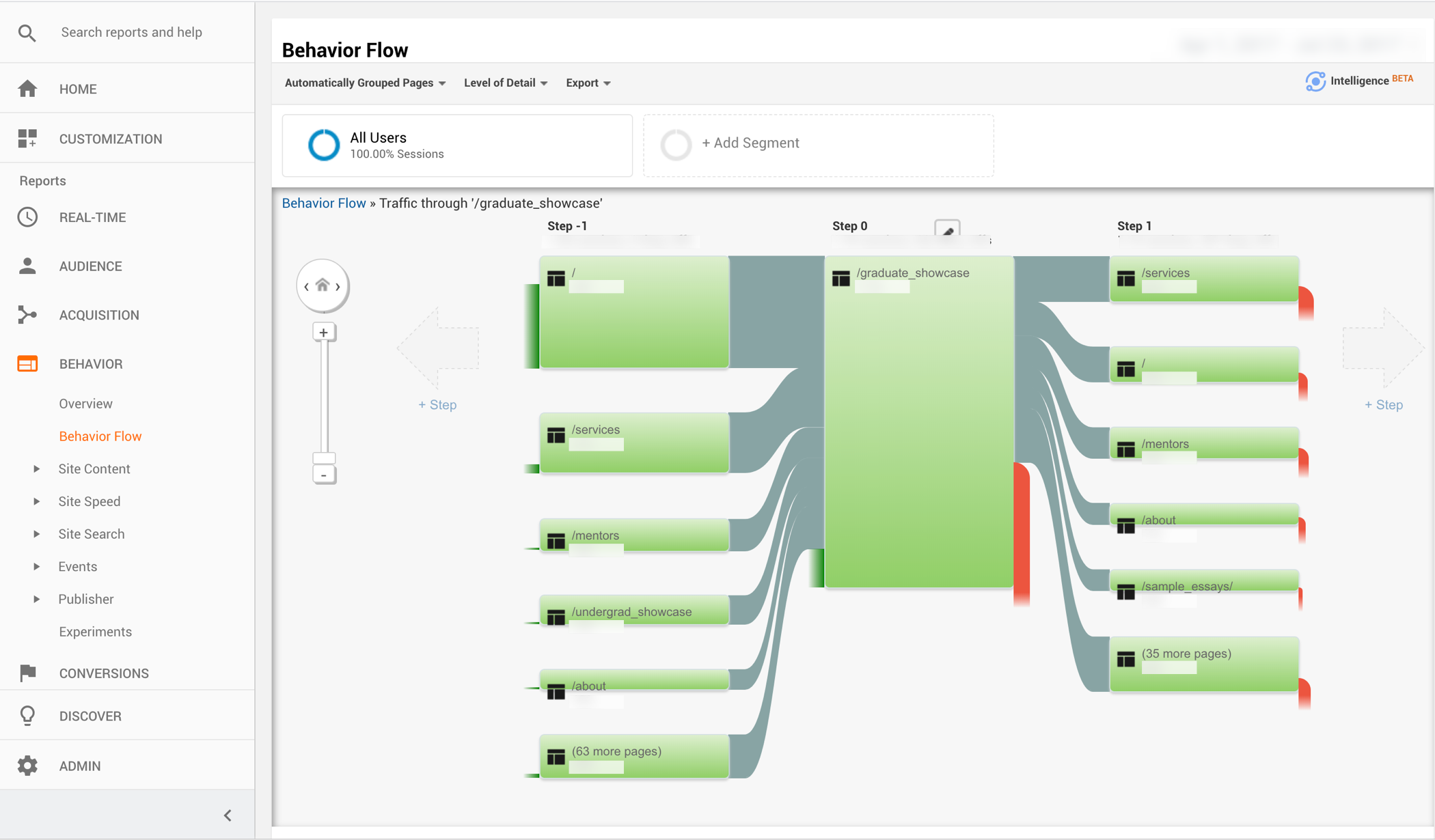
After talking to our sales departments, students, mentees and the coordinators who helped students to work with mentees, I found there is no clear navigation to lead users and no clear CTA to convert. After discussing with my team, I came with detailed web browsing user journey according to the new IA I created and listed out action items-
1. Clear and scalable Information Architecture to be executed
2. Existing pages worthy redesign or needed redesign, and pages needs to be aded for experience loop
3. Dominant and proactive entry points
4. Mobile friendly design

03_GOAL & METRICS
Since the goal was to convert via marketing site, I aimed at
1. Increasing the retention rate
2. Decreasing the bounce rate
3. Increasing sales leads from website.
04_CONTENT & WIREFRAMES
I did my first proposal with stakeholders - wireframes with content - to show a clear journey of how users fell in love with us step by step. I collaborated with the marketing team to come up with the final copy later.
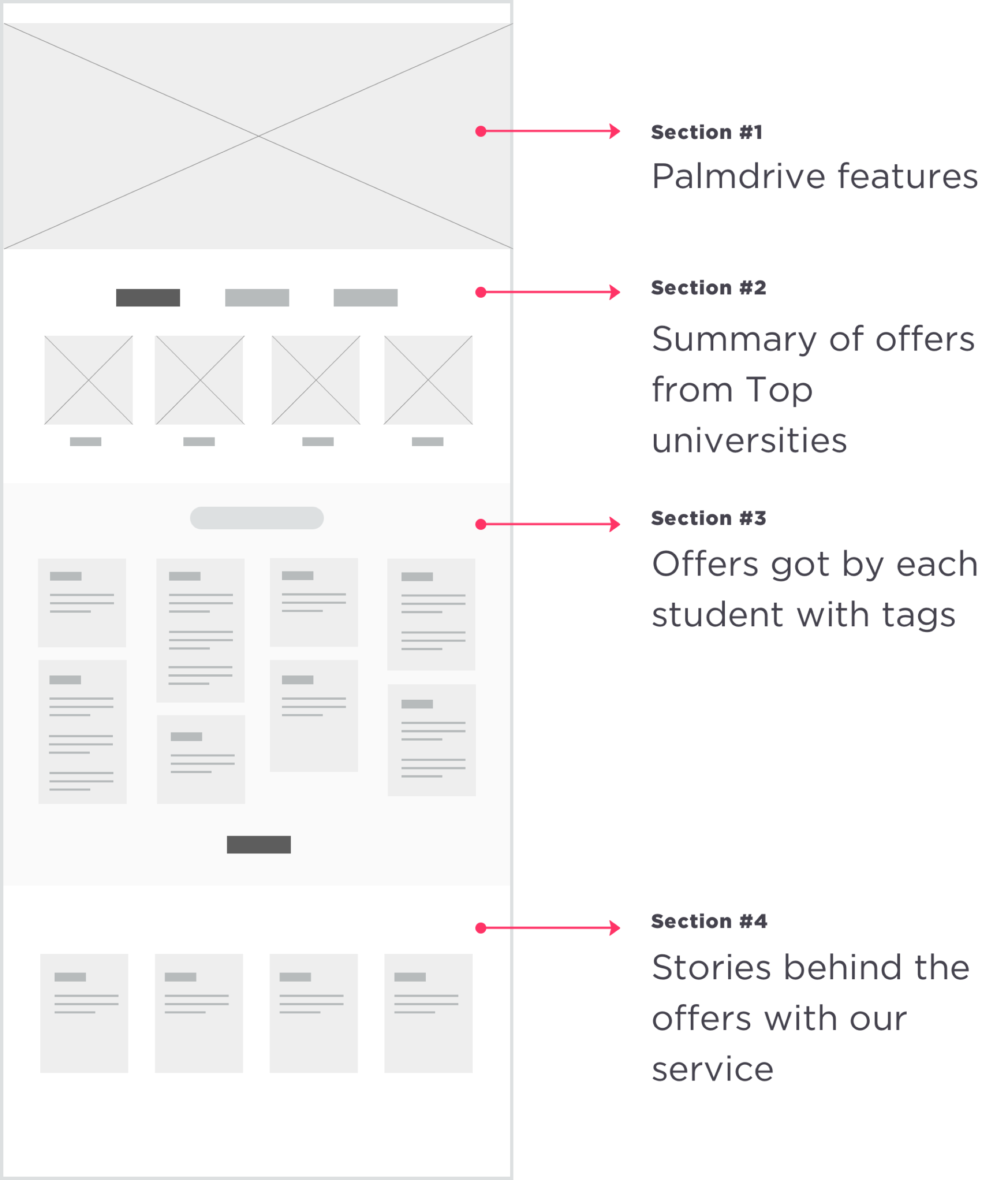
Graduate showcase page wireframes
05_VISUAL DESIGN
Since we were short of hands, I delivered design based on engineering resource dependency.
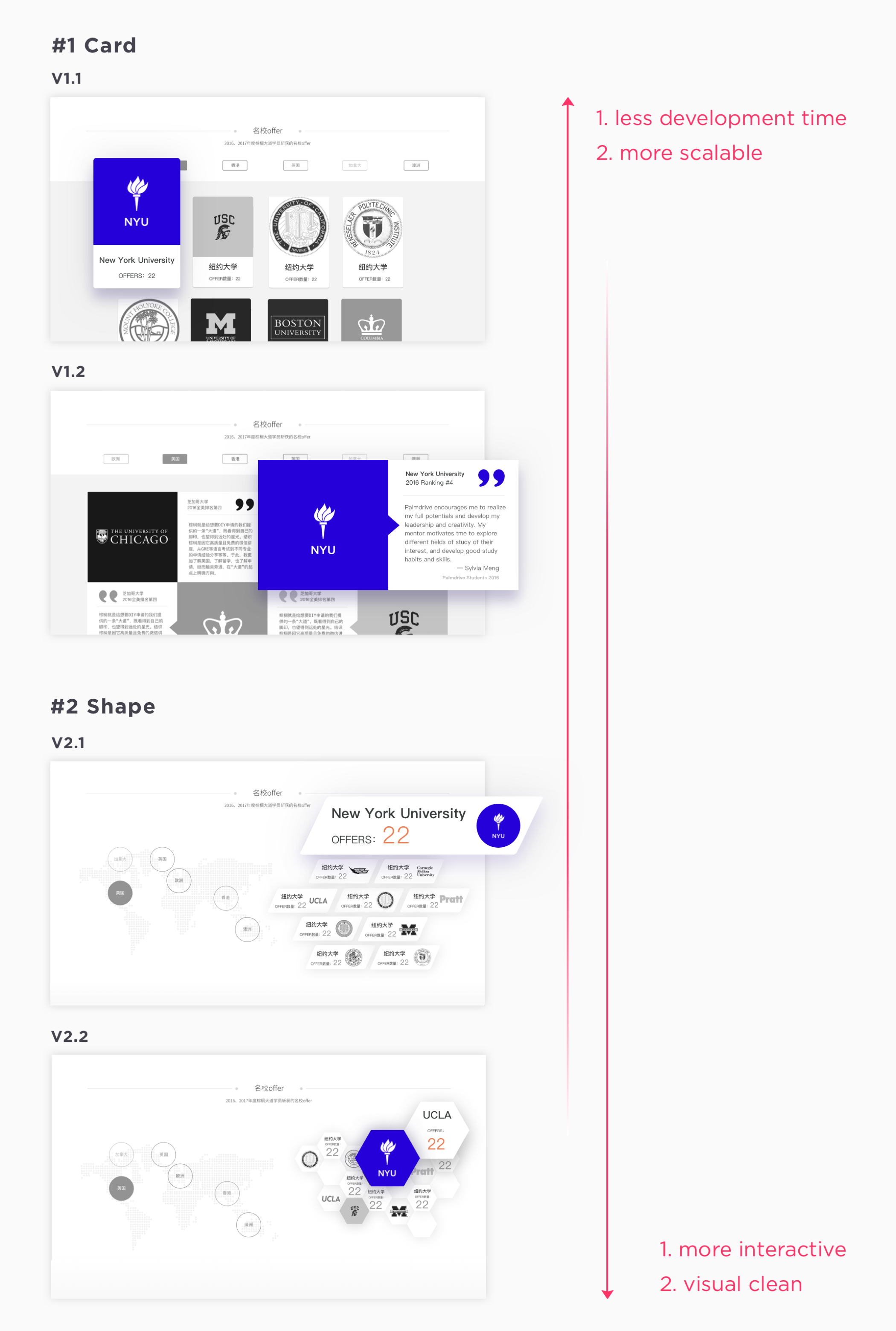
Offers from top universities display, graduate showcase page
After discussing with the team, we decided to expand based on v2.1. For the next round of design critique, I came with a prototype of the final design.
Offers from top universities display, graduate showcase page.Tool: Flinto
06_MOBILE FRIENDLY
As over half of the website visits are from mobile, the responsiveness of the website is important and necessary. I changed all the pages to mobile friendly, especially the service detail page that the students search for the most. The original one is a pdf version, users need to scroll horizontally and vertically to view, while the redesign ones can displayed elegantly on different sizes of screen and easy to maintain or scale.
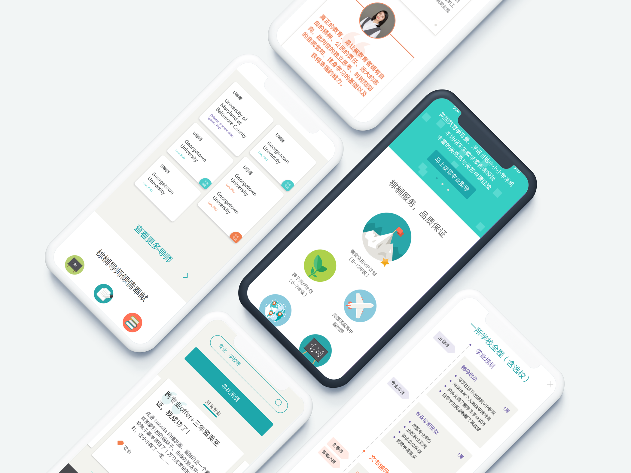
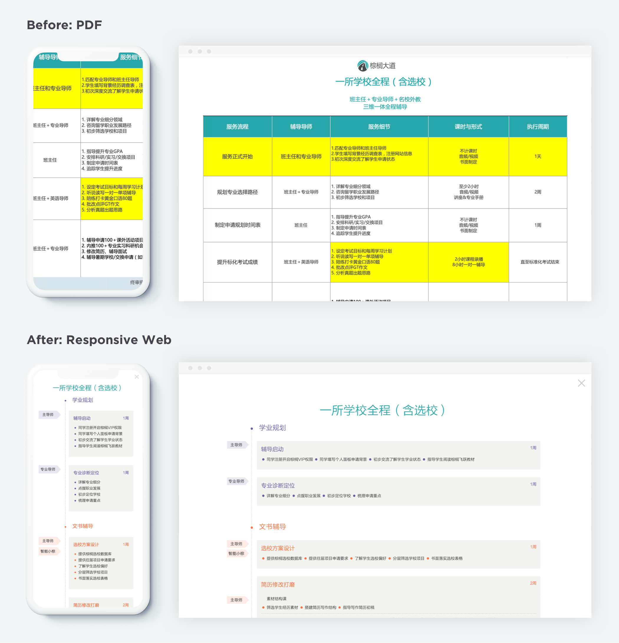
PDF service forms vs Responsive service timeline
07_RESULTS
Thanks to our teamwork, we shipped the marketing site in 8 weeks. I redesigned 6 pages, designed 7 new pages for both desktop and mobile, and also deliverd the style guide with UI components. The result turns out to be beyond our expectation.
- The bounce rate decreased 10% on average for the whole website and up to 75% for the redesigned pages.
- The pageviews increased 20% on average and up to 66% for the redesigned pages.
- The traffic on Service pages increased over 30%.
Graduate showcase page, redesigned
Graduate info page, redesigned
Since the graduate pages got a lot of success, I continued the redesign for high school pages.
High school page, redesigned
08_STYLE GUIDE & COMPONENT LIBRARY
After launching the website, I created master style guides for marketing team, and expanded ready-to-use libraries of common UI components with our engineering team.
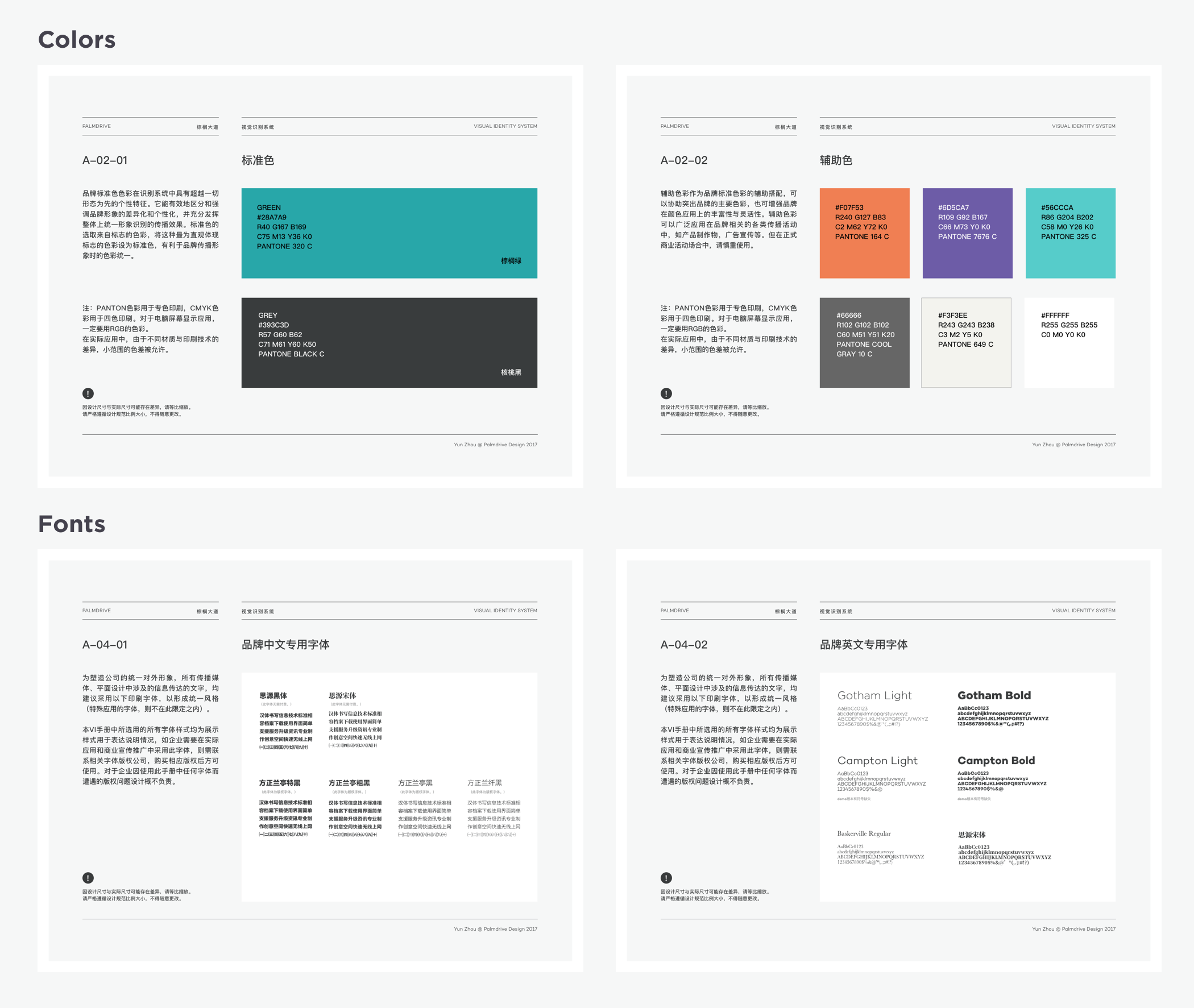
Several pages of Style Guide
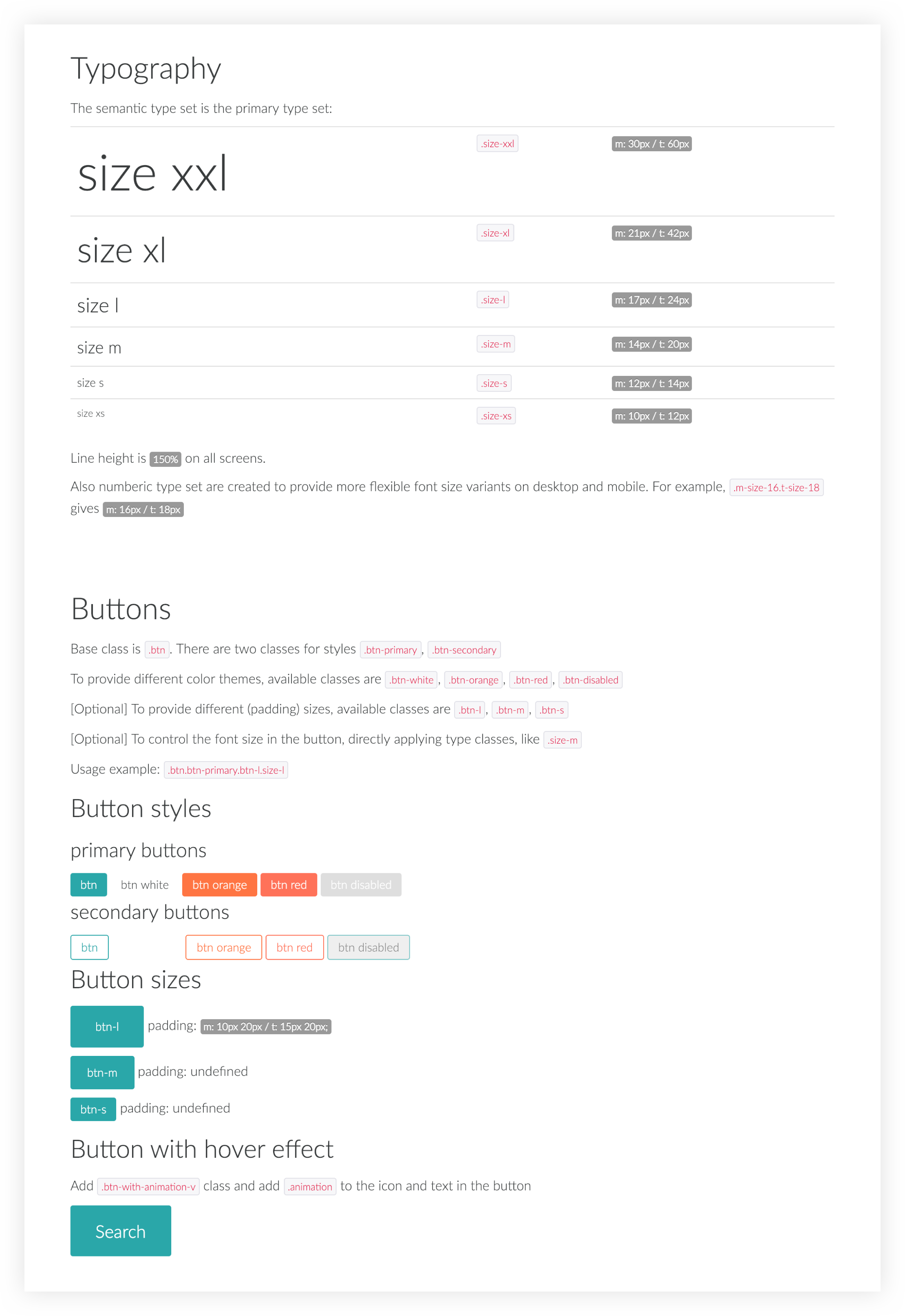
Screenshot of UI Kit.
Check UI Kit